Life Expectancy and the Built Environment in St. Louis, Missouri
Maybe you already know that public parks are great. Maybe you know that, besides just being the “lungs” of a city, they raise property values, promote economic activity, diminish negative environmental impacts, and offer people a place to get outdoors for recreation and exercise. And maybe they’re your hometown’s best spot for sledding come winter. But, I wondered, as a park lover, could they even make us live longer?
So let’s examine the association between the built environment and life expectancy. What is the built environment? The “built environment” is a catch-all term for features of your local area, built by humans, for the purposes of work, life, or play. Classic definitions include public parks and public transit, but researchers now include many more quantifiable features, including bicycling, healthy food access, and even mental health. For this analysis, I have gathered data on at least seven aspects of the built environment, and built a tool for residents of my hometown (St. Louis, MO), to view both some built environment features near them, as well as the effect on their neighborhood’s life expectancy.
It is intuitive and uncontroversial that, like public parks, built environment features have a demonstrable effect on public health. Proximity to a public park encourages more walking, and increasing cardiorespiratory fitness is better for public health. This is a burgeoning area of study in public health research, with rigorous tools for quantifying the built environment still being vetted, but scholars have already noted effects in public health. The future is certain: more effects, and more specific effects, will be determined in this relationship.
Would this matter if you didn’t care about public health? First of all, most of these features of the built environment are built and maintained using (your) public dollars. You deserve the opportunity to see the impact of your (and all of our) spending. Secondly, we all benefit when we shine a light on disparities in public health, ascertain if it corresponds with disparities in public investment, and strive to spend the public health dollars of a government “for the people, by the people” on improving the public health of all its constituents.
Specifically, we are measuring the association of the features of the built environment with public health in St. Louis, MO. Public health is life expectancy, in years, measured by the NCHS’s USALEEP project for each census tract (see below for links to data). Census tracts are a small geographic unit determined by the census bureau; consider that the city of St. Louis, with 300,000+ residents, has 106 census tracts. The built environment is measured through a combination of public or community gardens (both conventional community gardens as well as the city’s Milkweed for Monarchs program), public transit (as measured by number of light rail stations in each census tract), length of bike lanes and area of public parks in a census tract, and a scaled score from the EPA measuring “walkability.” I have also included a proxy measure of socioeconomic status (SES) because it plays such a large role in this association: percent of the adult population in each census tract without health insurance.
I began by reading in my collected data. (For all the code and for more discussion, please see my Jupyter notebook. )
- ‘GEOID’ : the 11-digit FIPS code for each census tract
- ‘land_perc’ : the percent of each census tract that GIS calculated to be land (i.e. not water)
- ‘food1’ : a USDA calculated percentage of the total census tract with low access to healthy food within 1 mile
- ‘food2’ : similarly, the percentage of the low-income population in the census tract with low access to healthy food within 1 mile
- ‘life’ : life expectancy, in years, at birth for the census tract
- ‘mw’ : number of milkweed gardens in each census tract, planted to encourage the monarch butterfly population
- ‘cg’ : number of community gardens in each census tract
- ‘metrolink’ : number of Metrolink (light rail) stations in each census tract
- ‘tract_area’ : area (units unclear due to GIS projection issues) of each census tract
- ‘bike_len’ : total length of bike lanes for each census tract
- ‘bike_cnt’: total segments of bike lanes for each census tract
- ‘park1’ : total area of parks in each census tract (for similar reasons, units unclear)
- ‘park1ratio’ : ratio of park1 / tract_area => the ratio of a census tract that is public parks
- ‘park2’ , ‘park2ratio’ : a different (and inferior) polygon intersection tool was used in GIS to compute these park areas, in the same schema as park1 and park1ratio
- ‘walk’ : National Walkability Index from the EPA Note that these scores are provided for census block groups, so these have been averaged over tracts here
- ‘unins’: percentage of the adult non-institutionalized population without health insurance in each census tract, from Census American FactFinder
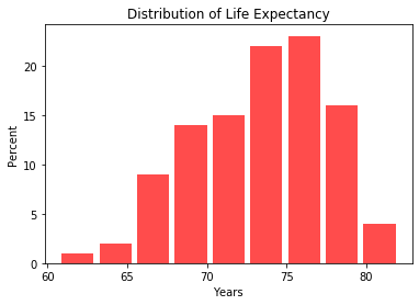
This histogram visualizes the distribution of measured life expectancy in St. Louis. 
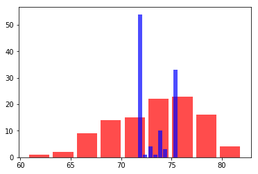
After testing a variety of machine learning algorithms (see Jupyter notebook), I cross-validated a gradient boosting regression model, and produced a model predicting census tract life expectancy based on eight features of the built environment: healthy food access, milkweed gardens, community gardens, Metrolink stations, bike lanes, park area, Walkability, and percent uninsured, a proxy for socioeconomic status. The model’s coefficient of determination, a metric assessing model fit, was 0.27, which does not indicate a strong association. In the histogram below, I have overlaid the model’s predicted life expectancies (blue) over the measured life expectancies by census tract (red).

Nevertheless, I built an interactive choropleth in Bokeh to show each census tract’s observed life expectancy, the model’s predicted life expectancy, and each of our built environment features. The map’s color scheme is like a heat-map, where the distribution of selected feature is represented by the different colors on the gradient. Check it out at Heroku! Sorry if it takes a second to load.
Hope you enjoyed!